






QuillKits Quill Navigation Redesign Northwestern Medicine TL Design System Nibble

Navigation Redesign

Navigation Redesign

User Research

Tree Testing

Card Sorts

Content Auditing

Mobile Design

Wireframing

This project challenged me to shift from a B2C mindset, balancing B2B shopping motivations with Quill's business goals and priorities as I redesigned its navigation menus to create a clearer path to product discovery across desktop and mobile experiences.

JN Creatives Quill Nav Designs

Navigation Redesign

User Research

Tree Testing

Card Sorts

Content Auditing

Mobile Design

Wireframing

This project challenged me to shift from a B2C mindset, balancing B2B shopping motivations with Quill's business goals and priorities as I redesigned its navigation menus to create a clearer path to product discovery across desktop and mobile experiences.


01

The Challenge

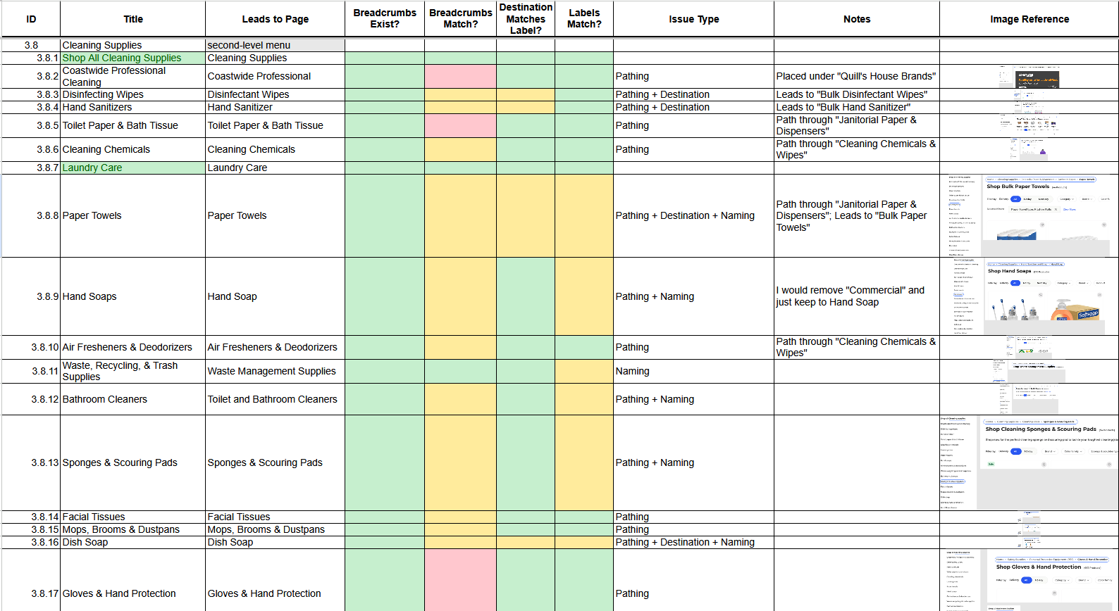
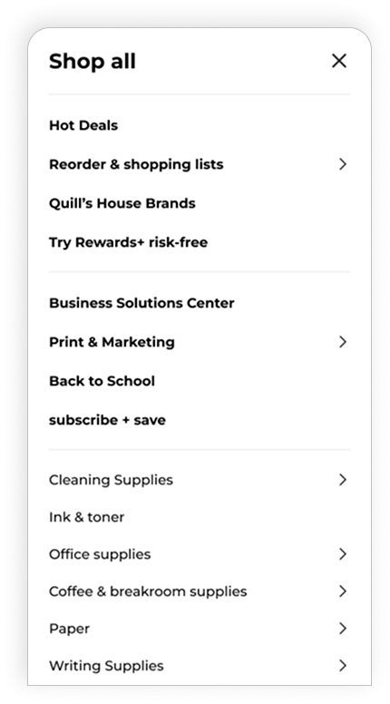
I began by auditing Quill's navigation through a content inventory, mapping each menu item and its destination to understand the existing structure. This revealed inconsistencies in design and labeling, redundant links, unclear category organization, and limited visibility of key options that made product exploration more difficult.

Click to Expand

02

Reframing the Goal

Through conversations with stakeholders and fellow designers, I challenged my initial assumption that the goal of navigation was to help users find products as quickly as possible. Since search is inherently better suited for speed and known-item retrieval, I reframed the navigation experience around exploration and discovery —making it easier for users to browse Quill's catalog, encounter relevant products, and potentially increase basket size.

03

Initial Research

Competitive Audit

I evaluated leading competitors against 16 guidelines from the Baymard Institute, focusing on navigation and category taxonomy.


Read the full report →
Competitive Audit Key

Overall Follow Rating
The performance of each competitor against all 16 Baymard guidelines.

Overall Follow Rating

Navigation Guidelines
The performance of each competitor against 8 Baymard guidelines focused solely on navigation and menu design.

Navigation Follow Rating

Category Taxonomy Guidelines
The performance of each competitor against 8 Baymard guidelines focused solely on category structure, labeling, and organization.

Category Taxonomy Follow Rating
lightbulb icon

Key Insights


Quill's current navigation structure needs significant improvement to follow UX standards for e-commerce, with a larger focus on category taxonomy.

When redesigning, good competitors to look at are Office Depot, Office Supply, and Staples.

Quill's current navigation structure needs significant improvement to follow UX standards for e-commerce, with a larger focus on category taxonomy. When redesigning, good competitors to look at are Office Depot, Office Supply, and Staples.

Heuristic Evaluation

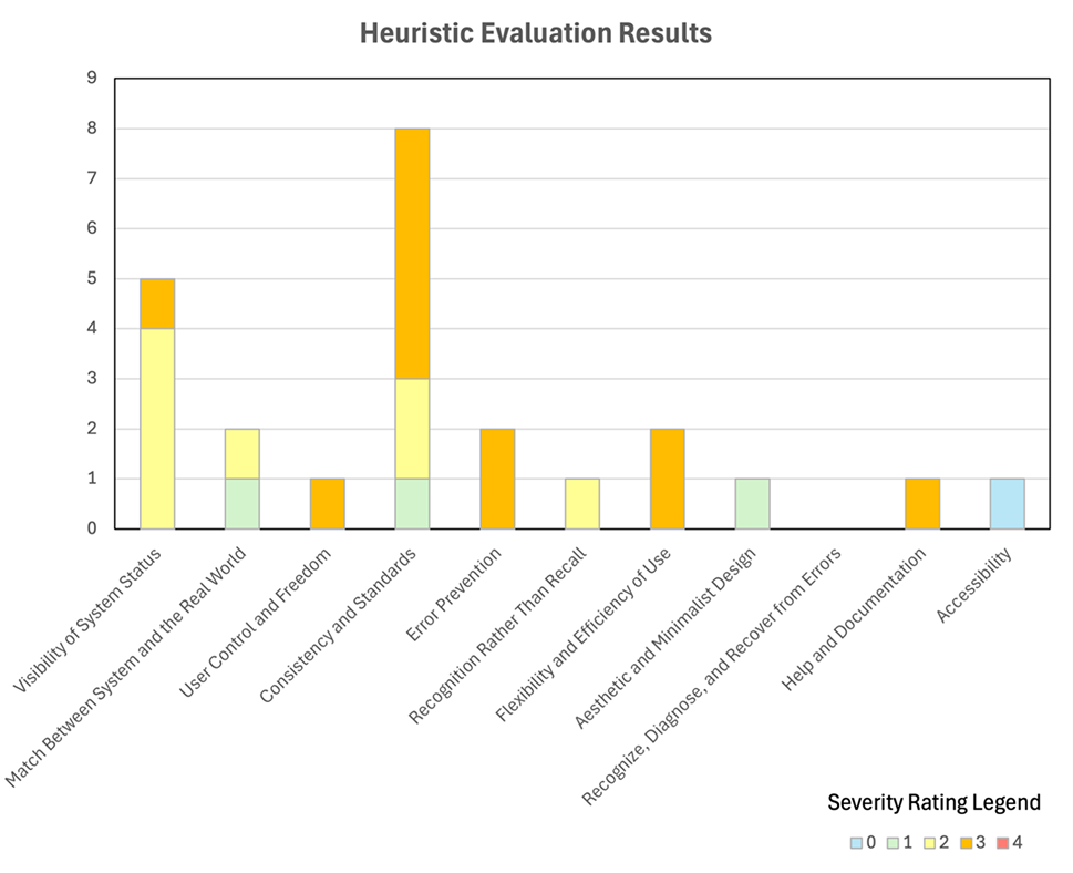
I then reviewed Quill's navigation against the Nielsen Norman Group's 10 usability heuristics plus an added accessibility guideline.

Most Violated Heuristics

  • Visibility of System Status - Quill's menu design provided limited visibility into available navigation options, making it difficult for users to understand what was accessible at a glance. Inconsistent visual cues also made it unclear which menu items were interactive.
  • Consistency and Standards - Visual and interaction inconsistencies, combined with redundant menu items across desktop and mobile, made the navigation experience less predictable and more difficult to use.

Read the full report →
Heuristic Evaluation Chart
Competitor Patterns

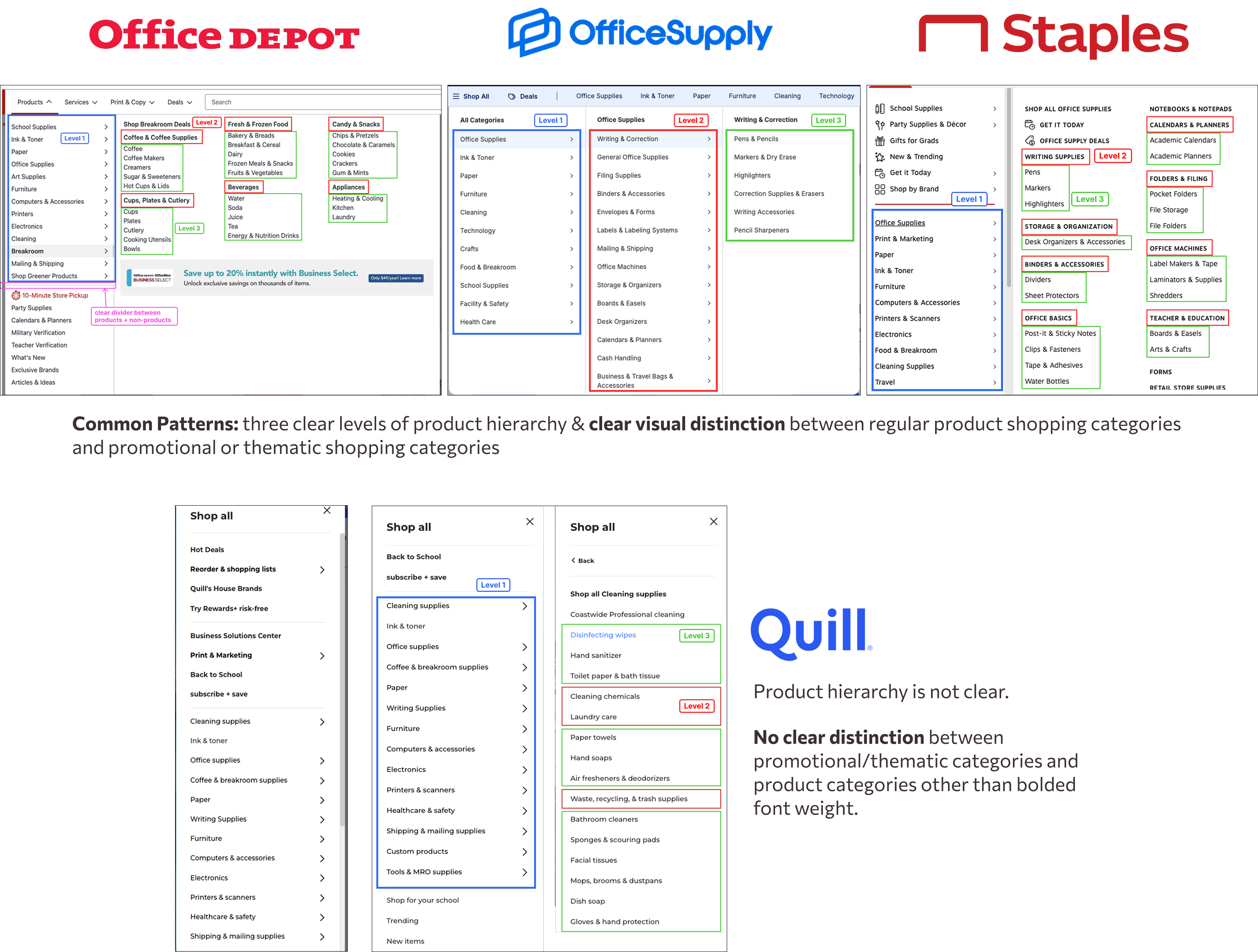
Before redesigning, I looked back at top-performing competitors from the Competitive Audit to identify common patterns and inform the redesign.

Competitor Patterns

04

From Research to Design Direction

Research revealed key opportunities to improve how menu items should be organized and presented.

Create a clearer product hierarchy
Organize categories, groupings, and products into a more intuitive structure.

Make navigation options more visible
Use clearer visual cues and interactions to make it clear which options are available.

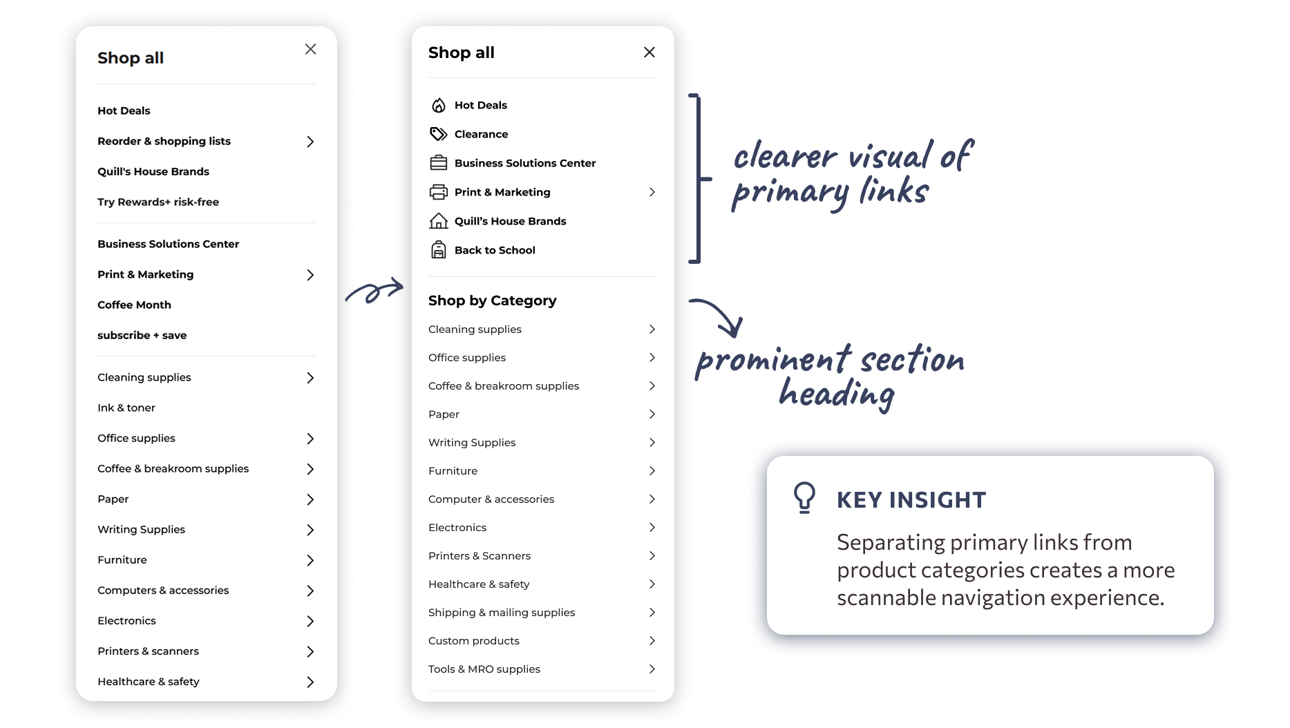
Separate high-priority links from product categories
Give promotional and utility links greater visibility while keeping product categories easy to browse.

05

Card Sorting

I ran remote, unmoderated card sorts to understand how users naturally grouped products within Quill's highest-engagement categories.


View the raw results →

Office
Supplies

74.4%

Office Supplies

74.4%

success rate

Cleaning Supplies

84.3%

Cleaning Supplies

84.3%

success rate

Coffee & Breakroom

90%

Coffee & Breakroom

90%

success rate

lightbulb icon

Key Insight


Office Supplies had the lowest success rate, revealing that some proposed groupings don't aligned with users' mental models. These findings informed category revisions before moving into tree testing.

06

Tree Testing

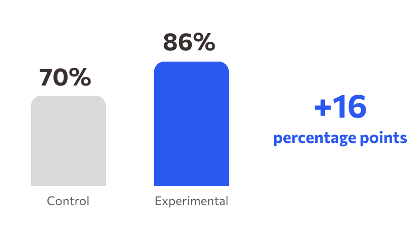
I compared the current Quill navigation (control) with a new proposed structure (experimental) to evaluate product findability.


View the raw results →

Overall Success Rate

Avg. Completion Time

4:16

control

4:16

experimental

Directness

76%

control

69%

experimental

Avg. Completion Time

4:16

control

4:16

experimental

Directness

76%

control

69%

experimental

lightbulb icon

Key Takeaway


The new structure increased overall task success by 16 percentage points. While users took slightly longer and directness decreased, the sample size wasn't big enough to determine whether this was significant to the success rate.

07

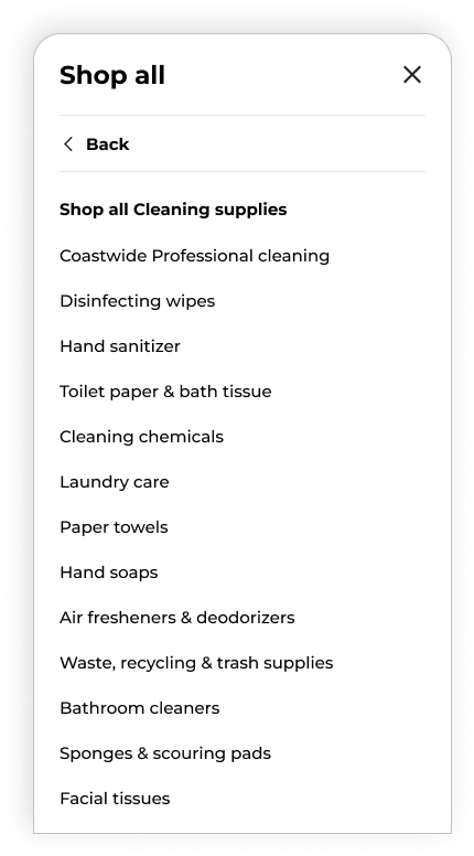
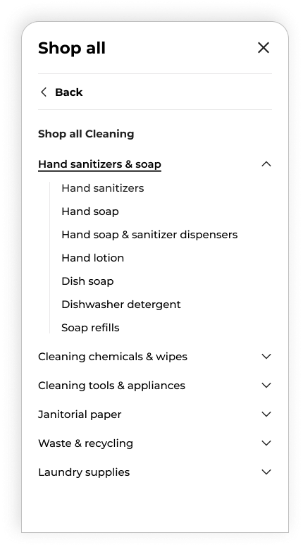
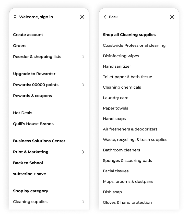
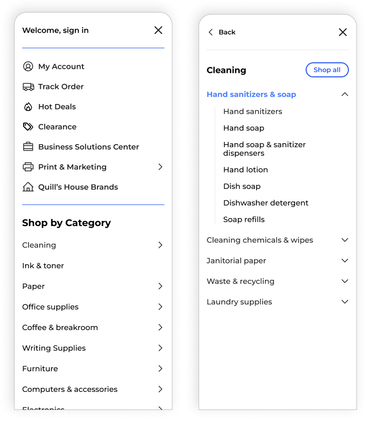
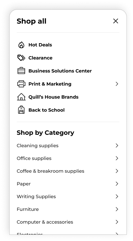
The Redesign

A new navigation structure designed to be more intuitive, consistent, and supportive of product discovery.

08

Business Opportunity

My redesigned navigation prioritizes high-engagement and high-conversion links, creating opportunities to increase their visibility while supporting product discovery and increased basket size.

3.2M

3.2M

unique visitors engaged with
main navigation header items

unique visitors engaged with main navigation header items

400K+

400K+

unique visitors engaged with
Hot Deals + Rewards & Coupons

unique visitors engaged with Hot Deals + Rewards & Coupons

2x + orders

2x + orders

shopping journeys involving these menu items had at least double the orders of the next highest engaged item

lightbulb icon

Key Insight


High-engagement menu items drive significantly more orders.

Prioritizing these links and improving their visibility can lead to more customers engaging and higher conversions.

09

My Takeaways

This project taught me how UX research can influence information architecture at scale and how navigation decisions need to balance user behavior, business priorities, and technical feasibility.

Better category taxonomy creates a clearer path to products.

Research can challenge the original direction of a project.

Navigation can support both usability and business goals.

Better category taxonomy creates a clearer path to products.

Research can challenge the original direction of a project.

Navigation can support both usability and business goals.