Nibble
Figma
Wireframing
Prototyping
Agile Method
Usability Testing
Iterative Design
Project Role: UX Designer & Prototyper
Date: April-June 2025
⇝ What were our design goals?
Streamline
food discovery by designing clear navigation flows and intuitive search/filter options.
Visualize
real-time crowd data through a heat-map feature, communicating availability at a glance.
Integrate
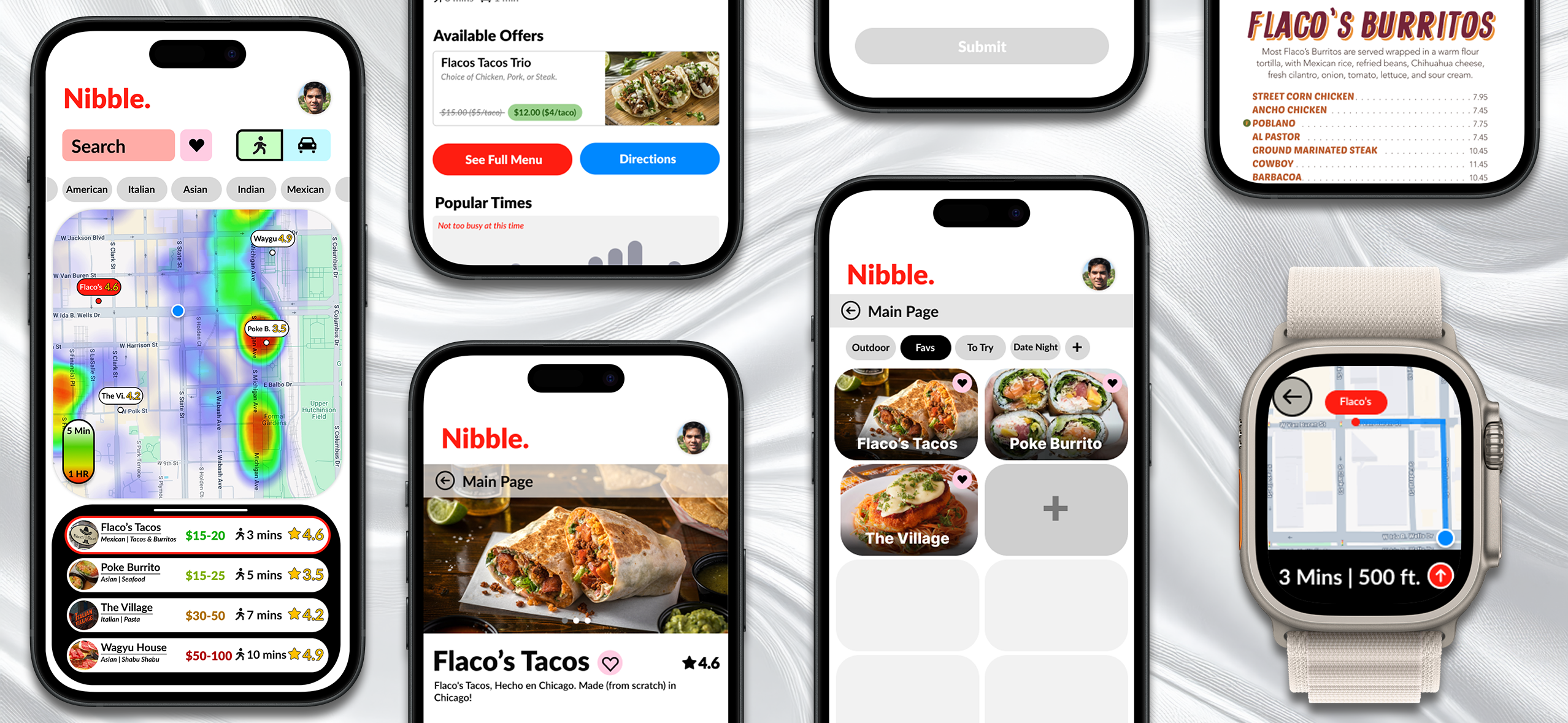
cross-platform interaction by extending key tasks to the smartwatch for convenience.
Support
decision-making with thoughtfully structured restaurant profiles that balance text, visuals, and user reviews.
Streamline
food discovery by designing clear navigation flows and intuitive search/filter options.
Visualize
real-time crowd data through a heat-map feature, communicating availability at a glance.
Integrate
cross-platform interaction by extending key tasks to the smartwatch for convenience.
Support
decision-making with thoughtfully structured restaurant profiles that balance text, visuals, and user reviews.
⇝ Who were our target users?

Primary Persona
Jack, 25 years old, Office Worker
Traits: Likes to explore Chicago and enjoys trying new food.
Needs:
- Explore restaurants near his current location.
- Narrow down his search for cuisine based on his mood.
- Filter out restaurants that don't fit within his budget.
- Find a place that is relaxing and outside of crowds.
Frustrations:
- Map apps often lack key details that make choosing cuisines easier.
- Map apps also show restaurants that are out of his preferred walking distance.
User Scenario
Usage Context:
After a long work week, Jack wants an easy way to find a good dinner nearby. He opens Nibble to discover something new without spending much time searching.
Filtering & Discovery:
Jack uses the heat map to see which areas are busy, then filters by cuisine to narrow his options. He selects Flaco’s Tacos based on proximity, low wait time, and positive reviews.
Cross-Platform Experience:
On his way out, Jack reopens Nibble on his Apple Watch to check distance and directions, seamlessly picking up where he left off on his phone.
Satisfaction & Retention:
After dinner, Jack leaves a positive review and feels confident returning to Nibble for future food discovery.
⇝ What was our ideation process?
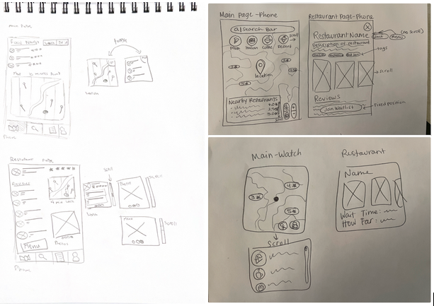
Design Charette
We conducted two 15-minute sketching sessions with a 20-minute discussion in between to review and consolidate ideas. We later split up wireframing tasks within the team.
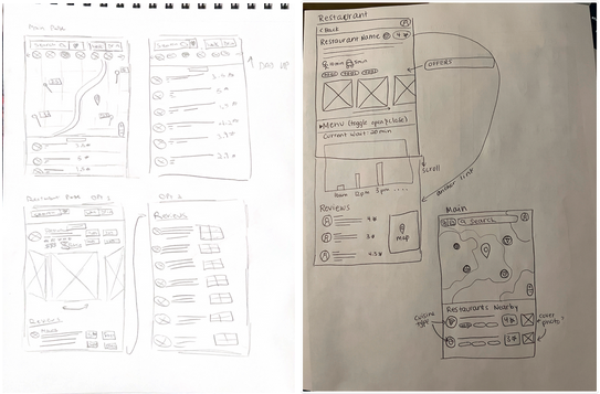
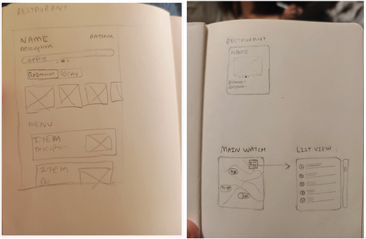
Initial Sketches
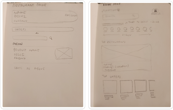
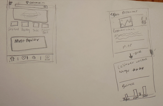
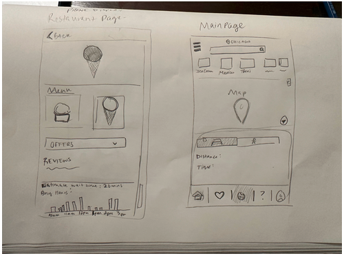
Refined Sketches
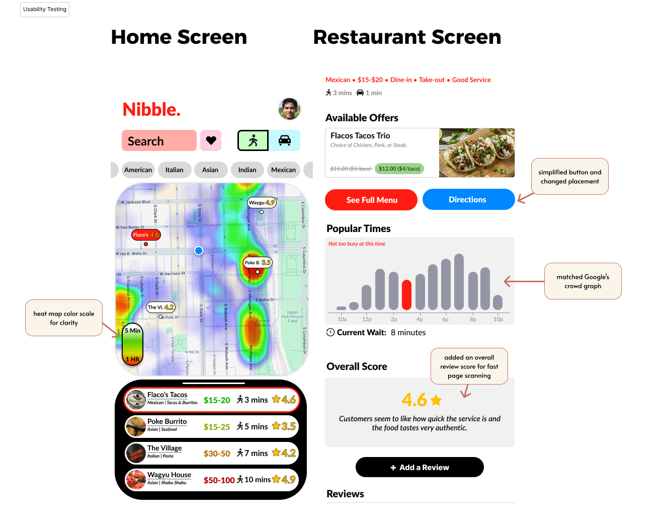
⇝ How did our product perform?
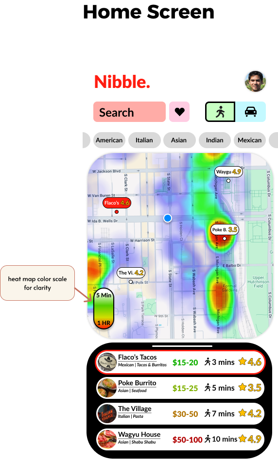
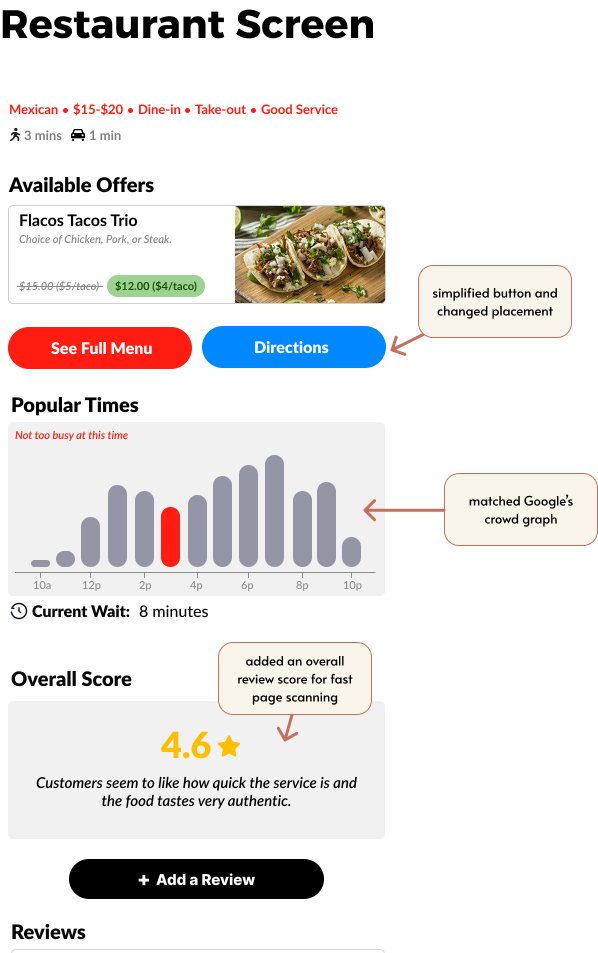
Usability Testing
We tested our mid-fidelity prototype with four participants using task-based scenarios and pre- and post-task questions to evaluate clarity and usability.
Key Findings
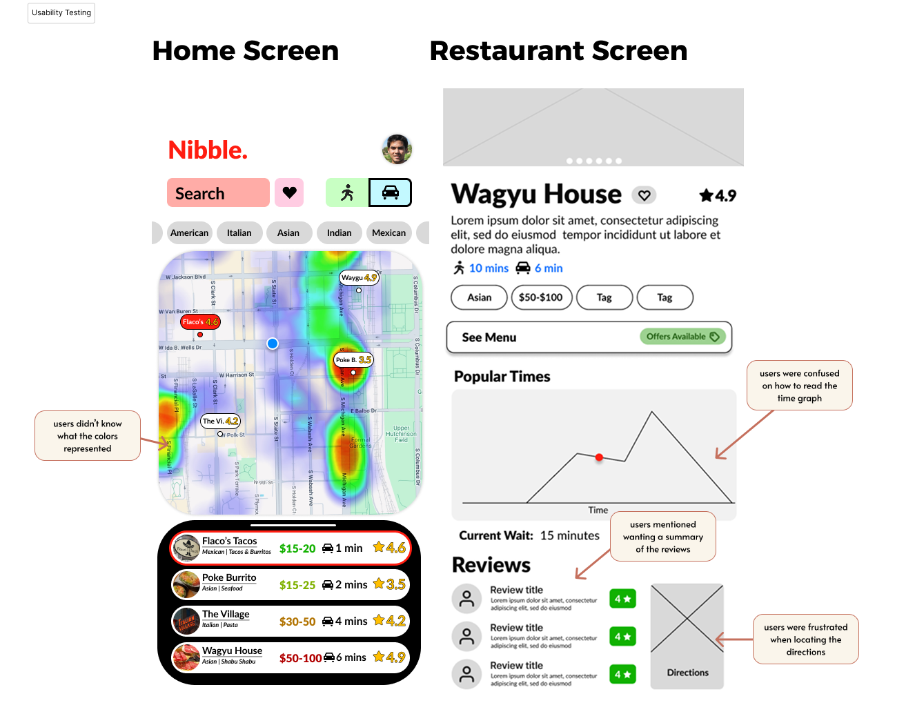
Testing Insight
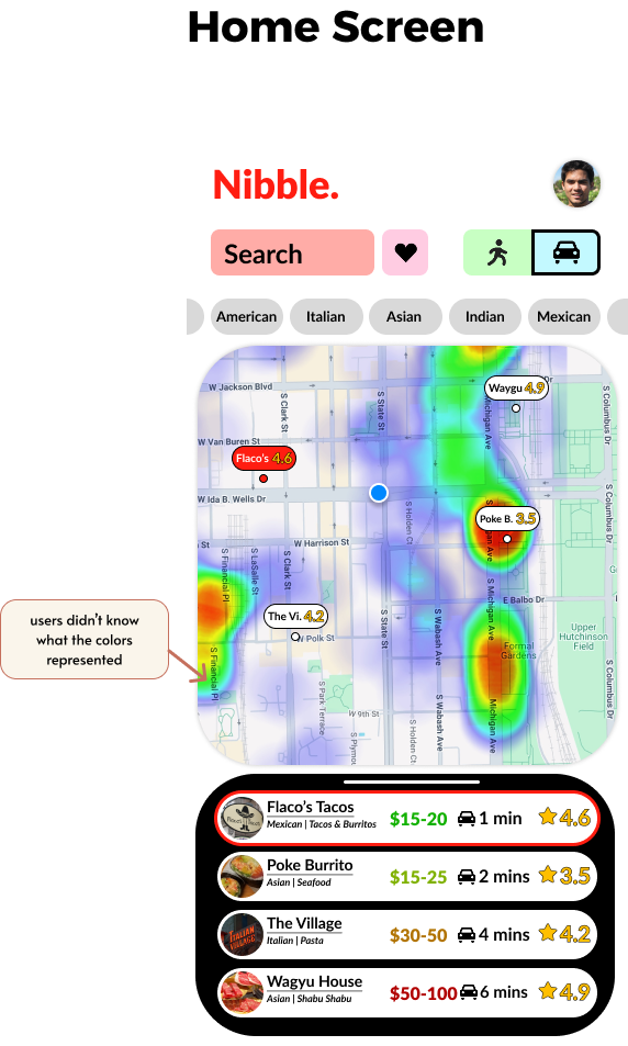
Heat map colors were unclear
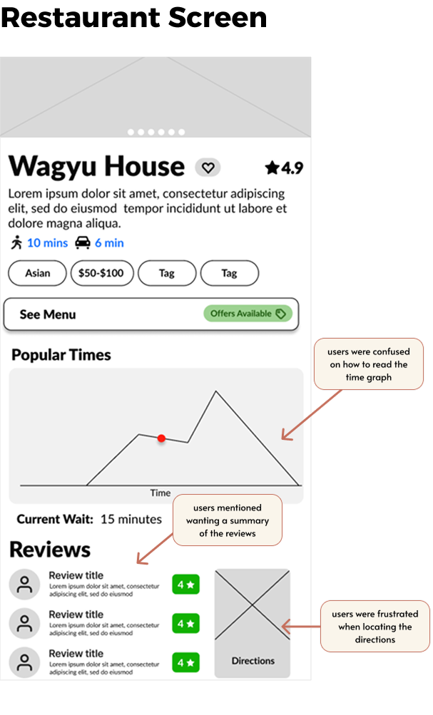
'Popular Times' graph was confusing
Users wanted faster trust signals
Users had trouble finding the 'Directions' button
Design Response
⇢ Added color scale
⇢ Matched Google Maps format
⇢ Added overall review score
⇢ Removed icon image for simplicity and moved button location
Design Improvements