Northwestern Medicine IA Redesign
User Research
Tree Testing
Card Sorts
Content Auditing
Mobile Design
Wireframing
Project Role: UX Researcher
Date: September-November 2025
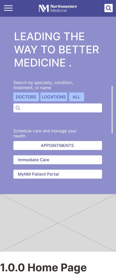
⇝ What was our research goal?
Improve User Experience
by simplifying content architecture and making site navigation more intuitive.
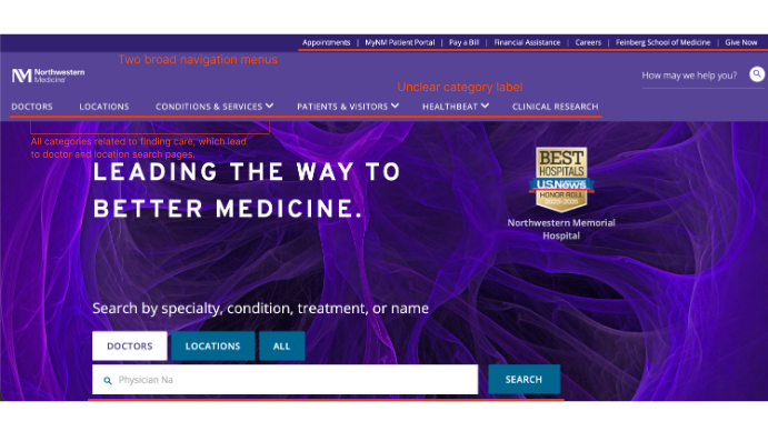
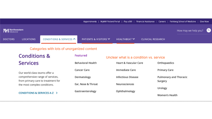
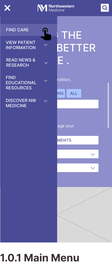
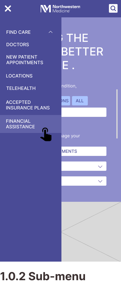
Current Design Issues
- There is an overwhelming volume of information.
- Large sub-menus make it harder for users to locate their target.
- Found two navigation bars with category inconsistencies.
- Ambiguous navigation bars.
- Current content hierarchy is not as intuitive as it could be.
User Types
Adults who are experiencing specific health concerns and need to find the right type of medical care, including a specialist for their symptoms. These users are motivated by their symptoms, potential diagnoses, or specialty needs.
Use Cases- Searching for a specialty doctor.
- Looking for a cost estimate for a specific service.
Adults who are new to a region or healthcare system and want to establish general care. These users prioritize finding a trustworthy doctor who fits their logistical constraints.
Use Case- Finding a care provider based on location or insurance plan.
⇝ Our Research Process
Heuristic Analysis
We conducted a heuristic analysis based on two key user tasks and summarized our findings to form design recommendations.
Task 1: Finding a Specialty Doctor
| Average Score | Recommendations |
|---|---|
| Support users' mental models: 2.6 |
|
| Surface options and provide feedback: 4 |
|
| Leverage design standards and conventions: 3.3 |
|
| Visually consistent and appealing: 3 |
|
| Recognition rather than recall: 3.6 |
|
| Prevent misinterpretation and errors: 3 |
|
| Help users recover from mistakes: 3 |
|
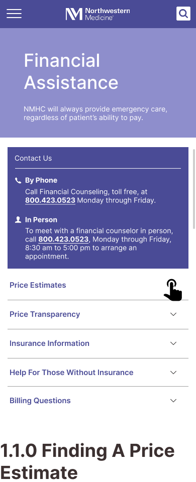
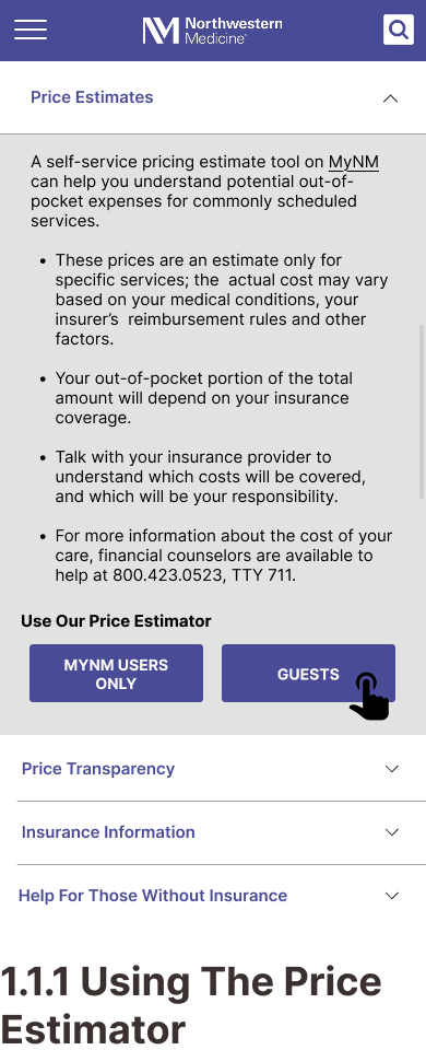
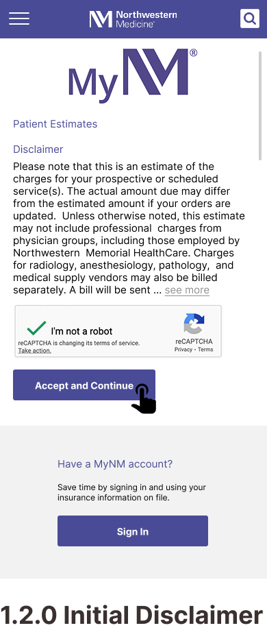
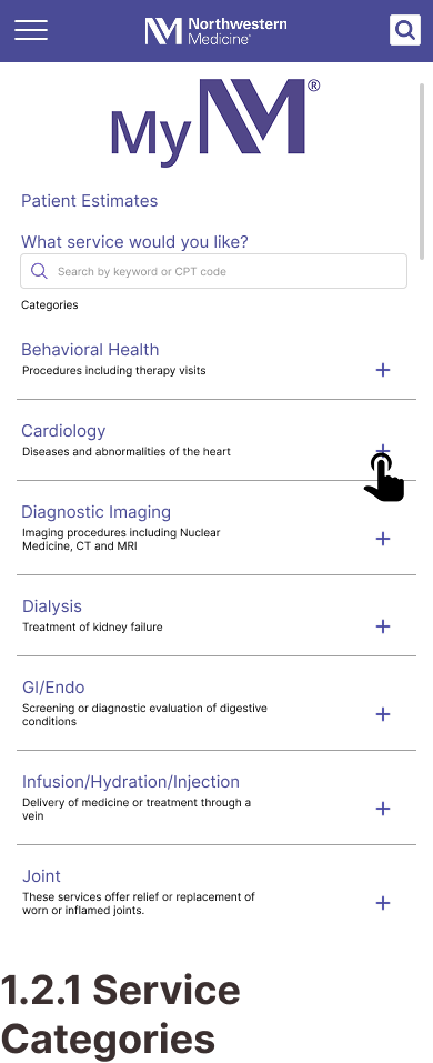
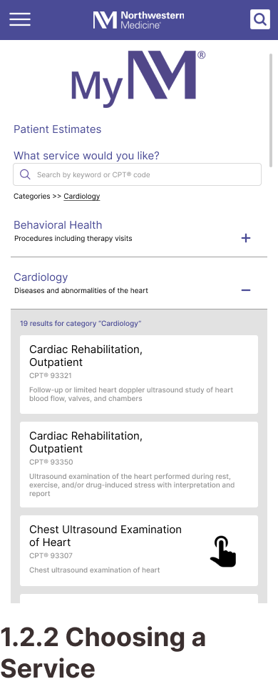
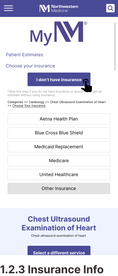
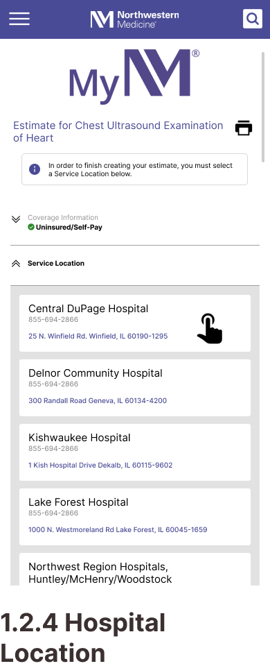
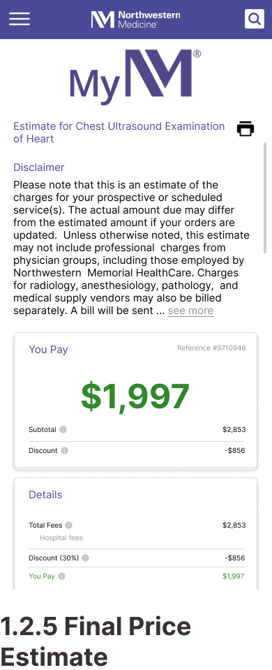
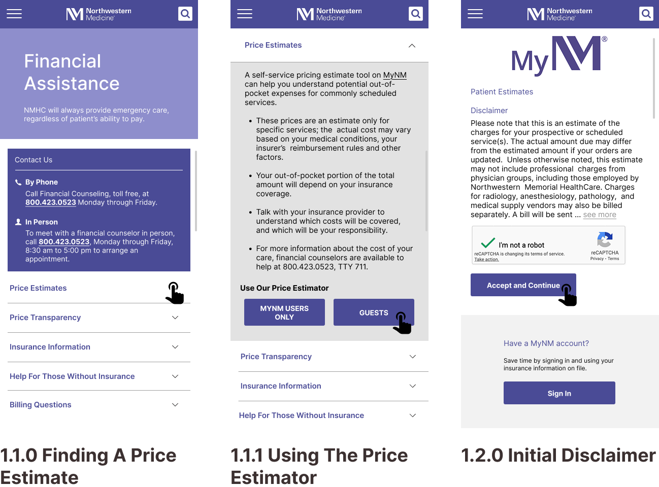
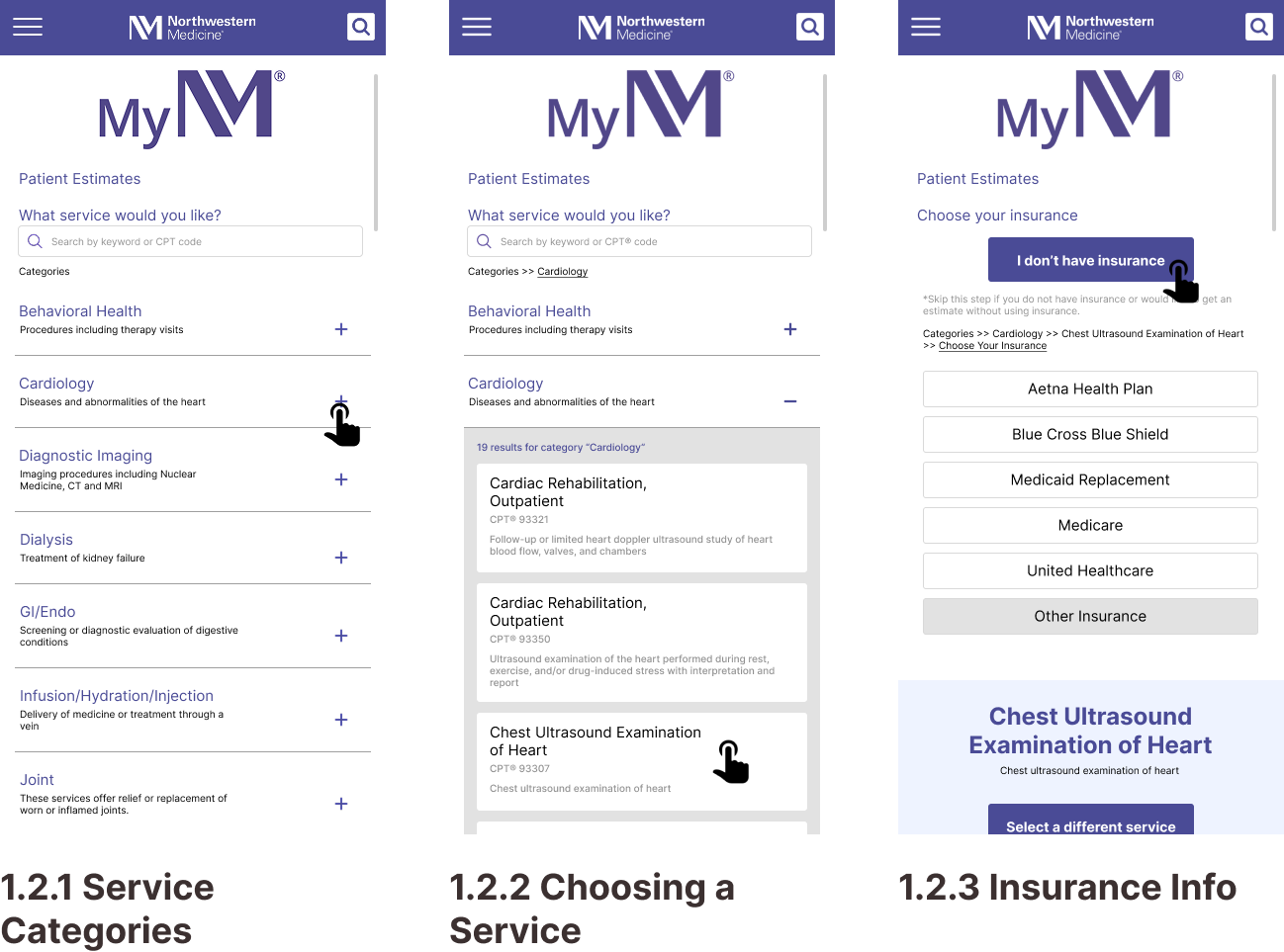
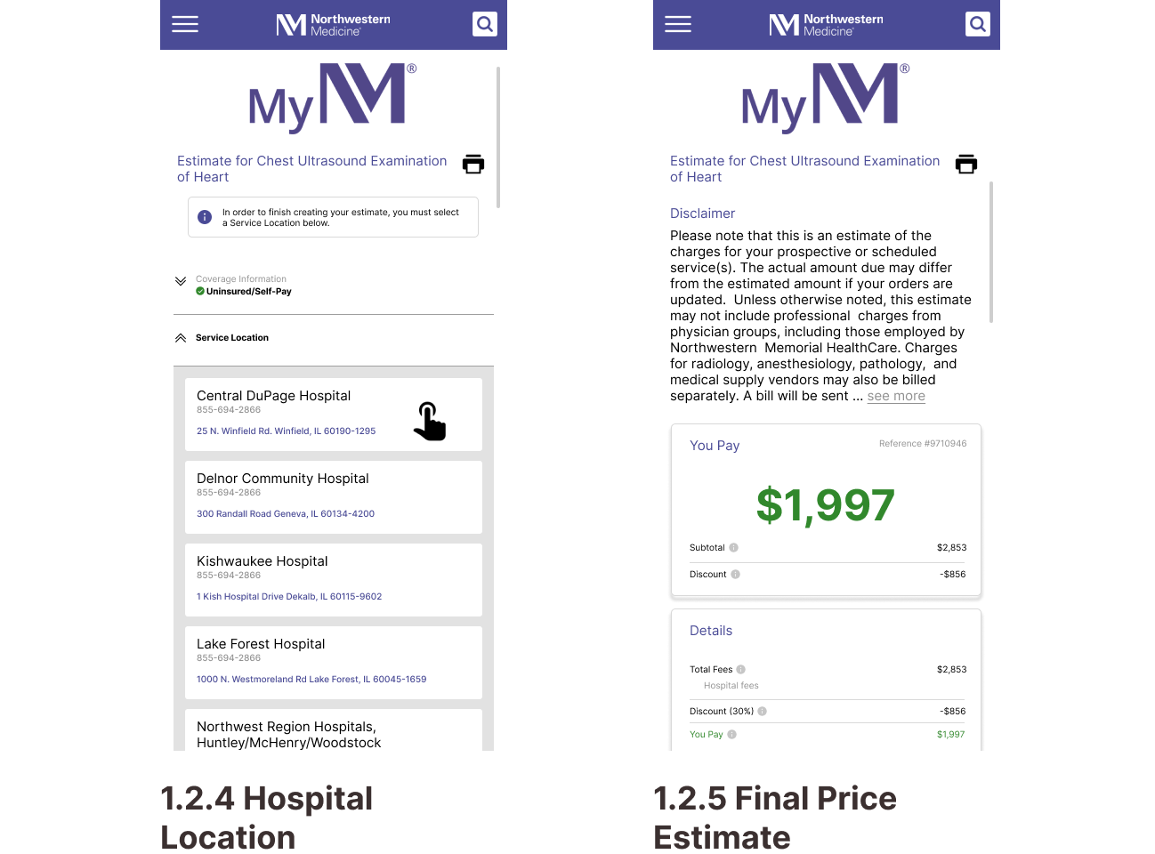
Task 2: Getting a Price Estimate as an Uninsured Visitor
| Average Score | Recommendations |
|---|---|
| Support users' mental models: 2.8 |
|
| Surface options and provide feedback: 3.3 |
|
| Leverage design standards and conventions: 3.3 |
|
| Visually consistent and appealing: 3 |
|
| Recognition rather than recall: 4 |
|
| Prevent misinterpretation and errors: 3.3 |
|
| Help users recover from mistakes: 4 |
|
How did our HA inform our wireframes?
Website maintains strong visual consistency and effective brand identity. However, the sheer volume of information displayed on pages make identification of key actions difficult.
Design ResponseRepeated content is consolidated and a clear information hierarchy is established using intentional variations in font size, color coded call-outs, and spacing.
Indication of uninsured status is somewhat hidden, delaying user access to pricing information.
Design ResponseA clear and prominent button is introduced for users to specify their status as uninsured.
Some current interface elements do not align with common UI patterns, impacting usability and overall task completion.
Design ResponseThe cards grid format for task 2 is replaced with a drop-down menu.
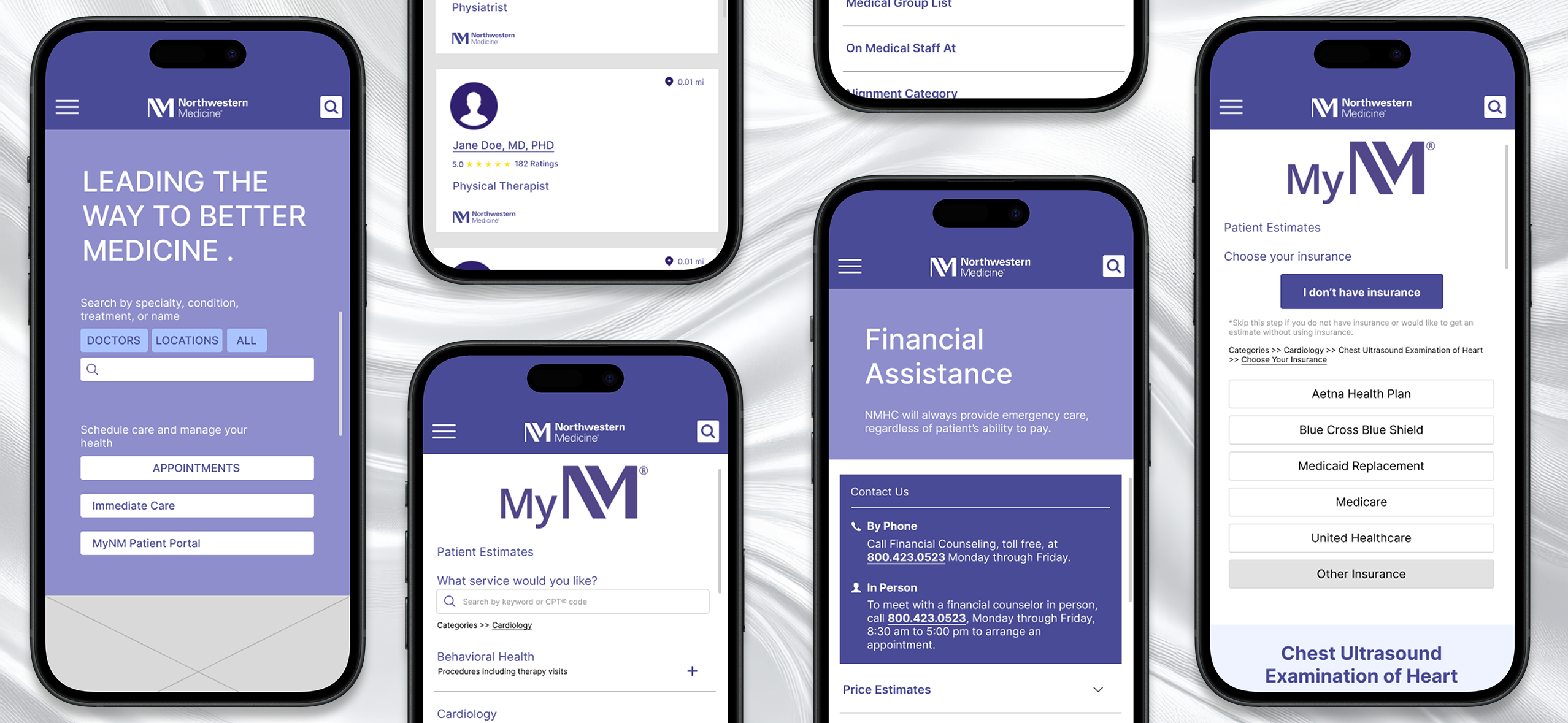
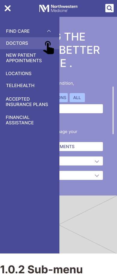
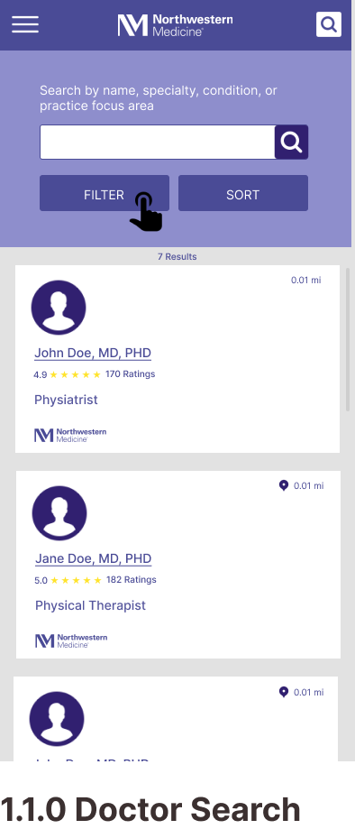
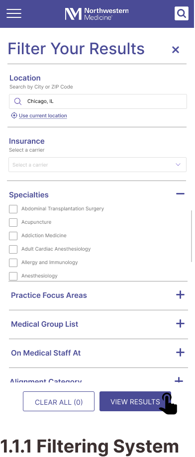
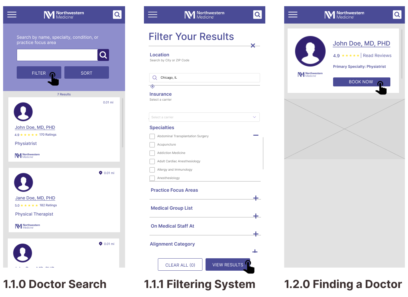
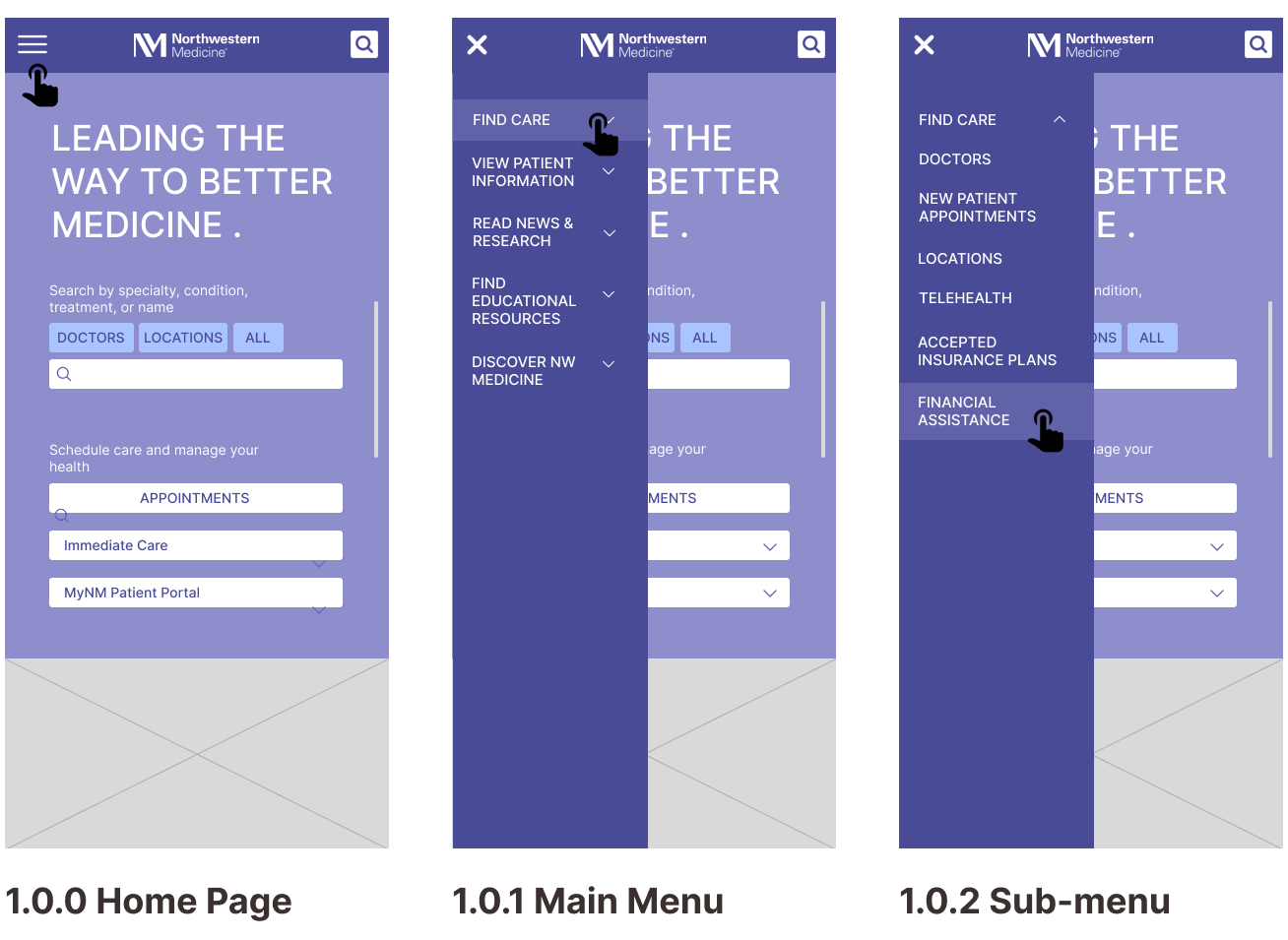
Mobile Wireframes
Task 1: Finding a Specialty Doctor


Task 2: Getting a Price Estimate as an Uninsured Visitor
Content Inventory
Our Goals:
- Understand the existing information architecture
- Identify redundant or unclear content
- Discover what was relevant to key user tasks
Content Audit Insights
- Redundant information and overlapping navigation
- An unclear organizational scheme
- A lack of clarity in labels and interface language
IA Design Changes
- Consolidated related information
- Removed pages and categories to improve organization
- Established a task-oriented organizational scheme for the main navigation menu
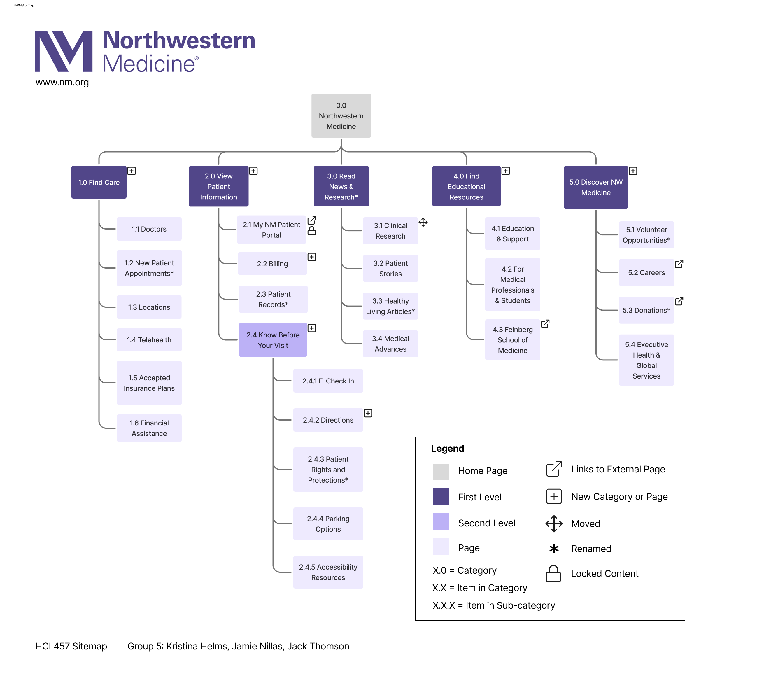
Proposed Navigation Structure
Card Sort Tests
All card sorting was conducted remotely using a closed, unmoderated method to validate our categories and structure.
- Pilot Round: 3 participants from HCI 457 at DePaul
- Round 1: 4 participants, recruited from the DePaul CDM participant pool
- Round 2: 8 participants, recruited from the DePaul CDM participant pool
Round 1 Results
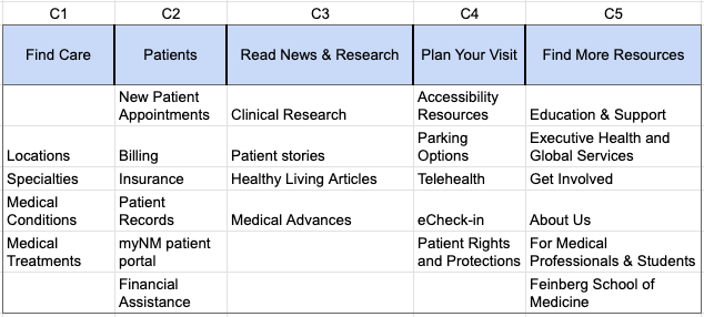
High Variance Cards
- 60% of participants placed Insurance, Medical Conditions, and Doctors in distinct incorrect categories. Only 40% of participants placed these cards correctly.
- 4/6 cards from 'Find More Resources' category had high variance or were placed under "I'm Not Sure".
- Only Education & Support and For Medical Professionals & Students were placed correctly.
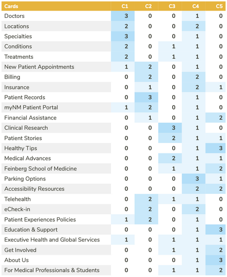
Incorrect Placements
- 80% Incorrect Placement
- Locations (frequently found under 'Plan Your Visit' category)
- Financial Assistance (frequently found under 'Find More Resources' category)
- 60% Incorrect Placement
- eCheck-in and Patient Rights & Protections (frequently found under 'Patients' category)
- Executive Health and Global Services (frequently found under 'Find Care')
Correct Placements
- 100% Correct Placement
- MyNM Patient Portal
- Patient Records
- 80% Correct Placement
- New Patient Appointments
- Billing
- Clinical Research
- Healthy Living Articles
- Education & Support
- For Medical Professionals & Students
Round 2 Results
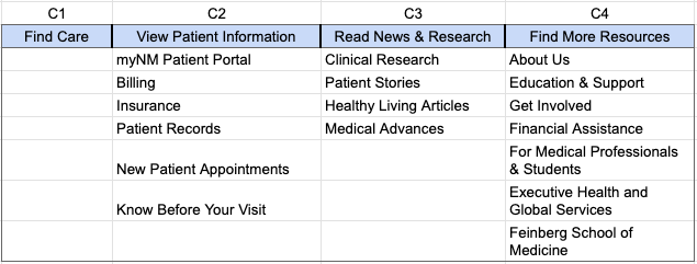
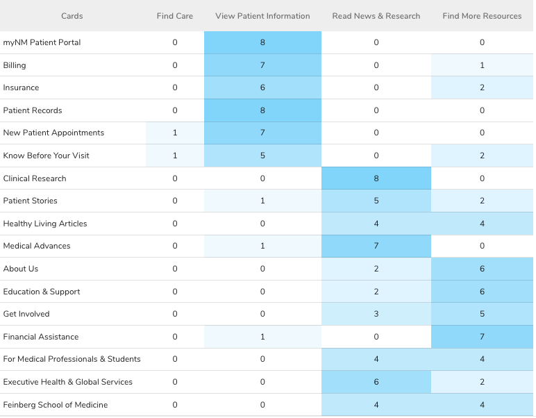
Split Variance Cards
- 50% of participants placed For Medical Professionals & Students, Feinberg School of Medicine, and Healthy Living Articles in the wrong category.
- For Medical Professionals & Students and Feinberg School of Medicine were found under 'Read News & Research'
- Healthy Living Articles was found under 'Find More Resources'
Incorrect Placements
- 75% Incorrect Placement
- Executive Health & Global Services (found in 'Read News & Research)
- 37.5% Incorrect Placement
- Know Before Your Visit (found in 'Find More Resources' by 2 participants and 'Find Care' by 1 participant)
- Patient Stories (found in 'Find More Resources' by 2 participants and 'View Patient Information' by 1 participant)
- Get Involved (found in 'Read News & Research')
Correct Placements
- 100% Correct Placement
- MyNM Patient Portal
- Patient Records
- Clinical Research
- 87.5% Correct Placement
- Billing
- New Patient Appointments
- Medical Advances
- Financial Assistance
- 75% Correct Placement
- Insurance
- About Us
- Education & Support
The Direct Impact
By consolidating cards and re-labeling categories to stay consistent with our task-based organizational structure, we saw an increase in overall correct card placements.
Tree Tests
All card sorting was conducted remotely using an unmoderated method to validate our site structure through user task success.
- Pilot Round: 4 participants from HCI 457 at DePaul
- Round 1: 9 participants, recruited from the DePaul CDM participant pool
- Round 2: 11 participants, recruited from the DePaul CDM participant pool
Task 1: Locating a Doctor for a Specific Condition
Task 1 Success
Round 1
100%
↘
Round 2
81.8%
Correct Paths
- R1: Find Care
- R2: Find Care > Doctors
Impact: A decrease in success rate by 18.2 percentage points
Our Analysis: We believe the decrease in task success was due to users expecting to find doctors under 'New Patient Appointments' as well as 'Find Care'.
Task 1 Success
Round 1
100%
↘
Round 2
81.8%
Task 2: Locating Accepted Insurance Plans
Task 2 Success
Round 1
100%
↘
Round 2
90.9%
Correct Paths
- R1: Find Care > Accepted Insurance Plans
- R2: Find Care > Accepted Insurance Plans
Impact: A decrease in success rate by 9.1 percentage points
Our Analysis: We believed the decrease was caused by variability in study participants and made no further changes to our site map.
Task 2 Success
Round 1
100%
↘
Round 2
90.9%
Task 3: Finding Remote Appointment Information
Task 3 Success
Round 1
44.4%
↗
Round 2
63.6%
Correct Paths
- R1:
- View Patient Information > Know Before Your Visit > Telehealth
- View Patient Information > Know Before Your Visit > Accessibility Resources
- R2:
- Find Care > Telehealth
- View Patient Information > Know Before Your Visit > Accessibility Resources
Impact: An increase in success rate by 9.1 percentage points
Our Analysis: We analyzed the failure paths for Round 1 and restructured our navigation for this task based on the most common path. This directly resulted in success rate improvement.
Task 3 Success
Round 1
44.4%
↗
Round 2
63.6%
Task 4: Getting a Cost Estimate
Task 4 Success
Round 1
77.8%
↗
Round 2
90.9%
Correct Paths
- R1:
- Find Care > Financial Assistance
- View Patient Information > Billing
- R2:
- Find Care > Financial Assistance
- View Patient Information > Billing
Impact: An increase in success rate by 22.2 percentage points
Our Analysis: We were confident in our navigation in this task so there were no changes made, however, we believe the success increase was due to participant variability.
Task 4 Success
Round 1
77.8%
↗
Round 2
90.9%
Task 5: Accessing Directions to NW Medicine Locations
Task 5 Success
Round 1
66.7%
↗
Round 2
100%
Correct Paths
- R1:
- View Patient Information > Know Before Your Visit > Locations
- R2:
- Find Care > Locations
- View Patient Information > Know Before Your Visit > Directions
Impact: An increase in success rate by 33.3 percentage points
Our Analysis: We added a second success path option seeing that many participants went to Find Care first in Round 1. This change is justified, as users may want to look at hospital locations first when seeking care.
Task 5 Success
Round 1
66.7%
↗
Round 2
100%
The Direct Impact
By making note of our participants' frequent failure paths, we were able to accommodate to users' natural mental models and improve the success rate of user task completion.
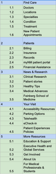
Sitemap